Brand Identity
I help shape brands from early visual direction through logo systems, typography, color, and launch-ready assets — building identities that feel clear, consistent, and usable from the start.
Featured Project
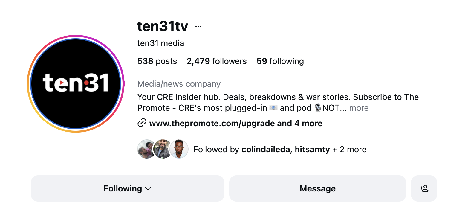
ten31
A media company focused on real estate storytelling through a wildly popular industry newsletter and digital content. Brooklyn House Media helped shape an existing name and brand appeal into a visual identity built to travel across social, video, and editorial formats from day one.
Brand Decisions
Wordmark
The name references Section 1031, a tax provision used by real estate investors. The wordmark was developed to carry that reference visually — legible, flexible, and built for digital formats.
Visual Language
Record and play symbols tie the identity directly to media — giving the mark a second layer of meaning beyond the name.
Typography
A modern sans-serif system scaled for social, editorial, and video without feeling generic.
Color
Red signals recording and energy. The rest of the palette stays neutral to keep the focus on content.
In Use
How the brand shows up in the world.
A glimpse of the identity translated into social content and brand publishing.
How I Work
Need help shaping a brand from the ground up?
Projects are usually structured around a defined scope rather than open-ended hourly work, with timeline, deliverables, and rounds of review clarified upfront.